I’ve been collecting new CSS things I stumble across that are helpful, made my life easier, or are just neat. Here are some of my favorites.
CSS clamp()
The clamp() function accepts three arguments: a minimum value, a preferred value, and a maximum value. This allows you to fluidly scale a property based on the viewport size, while still maintaining control over the minimum and maximum values.
One of my favorite uses of clamp is for font sizes. The first time I used vw I was stoked there was finally a way to make text flexible and responsive without the need to make multiple media queries and breakpoints. However it gets super unwieldy on larger and smaller screens. Clamp allows you to tame that shit.
h1 {
	font-size: clamp(1.5rem, 5vw, 3rem);
}
The perfect inner border radius
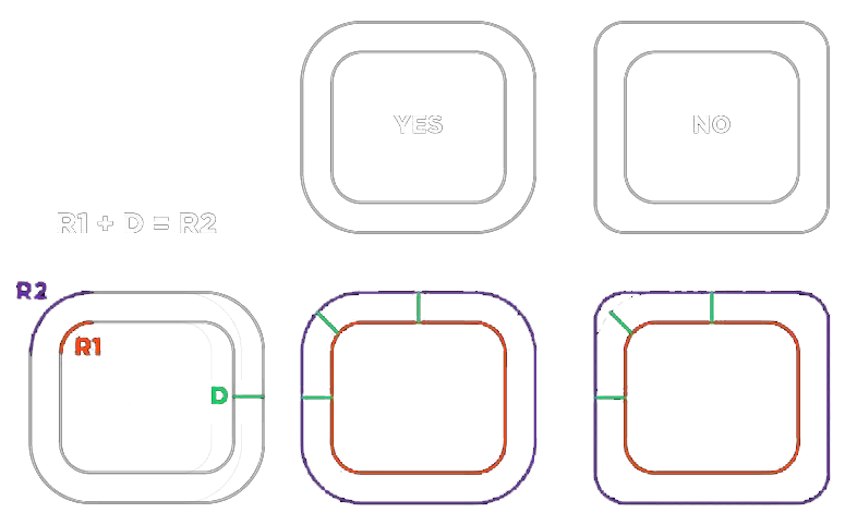
The traditional approach of using a single border radius value can result in imperfect corners that look like
I saved this diagram from twitter a while back (If you know who originally made it please let me know so I can credit them). It’s a nice visual of the formula for calculating the perfect inner border radius.
and here’s how we can implement it in CSS:
.card-outer {
	--radius: 20px;
	--border: 10px;
	/* Outer = inner + space between */
	border-radius: calc(var(--radius) + var(--border));
	padding: var(--border);
}

.card-inner {
	border-radius: var(--radius);
}Doesn’t the one on the left look so much better?
Aspect ratio, object-fit, and mix-blend-mode
I had a project that consisted of creating a grid of images and the images were made up of various sizes and aspect ratios. Setting the aspect ratio with aspect-ratio and object-fit made it super easy to ensure images were all the same size and didn’t have any white backgrounds. Additional tip: if, for example, you have photos of a product against a white background but you’re using a different colored background, you can use mix-blend-mode: color-burn to get rid of the white background (*note: this will only work on lighter colored backgrounds).
/* aspect ratio and object fit for inconsistently sized images */
.photos img {
	aspect-ratio: 3/2;
	object-fit: contain;
	/* to get rid of white backgrounds: */
	mix-blend-mode: color-burn;
}

/* for browsers that dont support aspect-ratio: */
.photos img::before {
	content: "";
	display: block;
	/* for an aspect ratio of 3/2 divide 2/3 * 100 */
	/* and set that as the padding-top % */
	padding-top: 66.666%;
}
Truncate a paragraph at x amount of lines
This is super useful for taming long paragraphs of text that you don’t have control over like maybe getting an overview from a blog post or something. I recently used this on an instagram feed and needed to truncate captions to 3 lines.
p {
	display: -webkit-box;
	-webkit-line-clamp: 3;
	-webkit-box-orient: vertical;
	overflow: hidden;
}
In action:
dvh/svh/lvh units
The new viewport units, namely dynamic viewport height (dvh), small viewport height (svh), and large viewport height (lvh), provide a better way to handle various viewport sizes and adapt to changes in the browsers interface elements. These units are especially useful for mobile devices where the toolbar or address bar can change the available space for content.
Here’s an example of how to use the new viewport units in CSS:
.full-height {
	height: 100vh; /* for browsers that dont support dvh or svh */
	height: 100dvh;
	height: 100svh;
}
These are fairly new and I haven’t used them much yet but keep them on your radar because they could potentially be super useful.
Custom list styles
I discovered this recently and thought it was kinda neat. Chris Coyier recently wrote a post on this technique for creating emoji lists that aren’t completely annoying for people who use screen readers.
.afancylist {
	list-style: rnbwdots;
}

@counter-style rnbwdots {
	system: cyclic;
	symbols: "🔴" "🟠" "🟡" "🟢" "🔵" "🟣";
	suffix: " ";
}
Example:
- List item 1
- List item 2
- List item 3
- List item 4
- List item 5
- List item 6
This example is a bit over the top but I mean look how easy it is to make your list bullets anything you want.
Backdrop blur
I recall trying to recreate this effect back in the day and it was a real pain in the
In action (hover over Mr. Freeman)
Morgan Freeman holding cotton candy.
Share 👍
Do you have any neat CSS things you’ve stumbled upon recently?
Let me know on twitter!